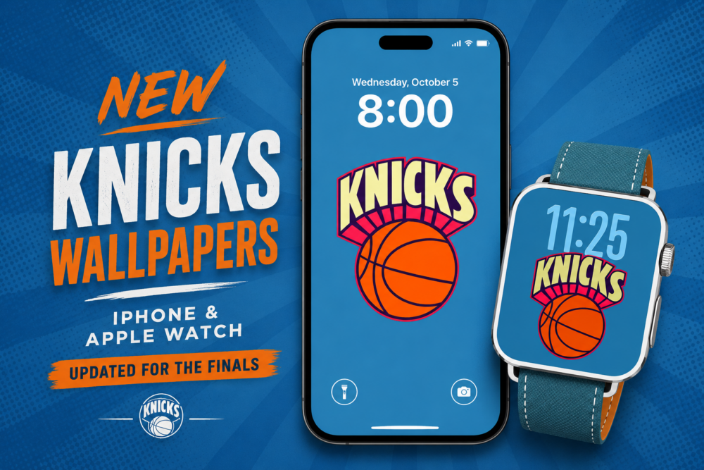
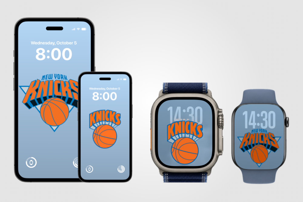
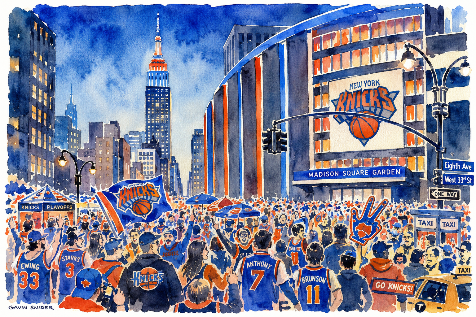
In Milo the Mongoose – Book 3: Lessons in Sharing & Speaking Up, Milo discovers how small choices—like sharing a breadfruit or telling the truth—can make a big difference. These gentle stories nurture honesty, selflessness, and emotional courage.
Category
Design
Milo the Mongoose – Book 2: Courage, Curiosity & a Cleaner Island
In Milo the Mongoose – Book 2: Adventures in Trying & Tidying, Milo returns with more island lessons—this time about courage and care. Whether it’s tasting an unfamiliar fruit or cleaning up the trail, Milo learns how little choices can make a big impact.
What a Box of Crayons Taught Me About UX Design
The macOS crayon color picker may look playful, but behind its simplicity lies a deep understanding of user behavior. Here’s why it’s one of the smartest UX decisions Apple ever made—and what it taught me about designing for real people.
Introducing Milo the Mongoose: A New Children’s Book Series from St. Croix
Meet Milo the Mongoose, a curious little creature from St. Croix who’s always learning, exploring, and making new friends. This heartwarming children’s book series invites young readers to enjoy island adventures while learning valuable lessons along the way.
Touring Midcentury Modern Architecture in Palm Springs
Palm Springs is a paradise for lovers of midcentury modern design. Use this guide to explore iconic homes and neighborhoods on your own self-guided tour — and always remember to respect homeowners’ privacy along the way.
Flighty on StandBy & Night Mode Indicators (Concept)
When Apple released iOS 17 they included a new feature called StandBy. It is designed to turn your iPhone into a bedside clock, a photo frame, a display for viewing widgets or Live Activities in full screen. Note that StandBy only works on iPhones that support the always-on display (e.g., iPhone 14 Pro, iPhone 14…
Chart Choosing
When building dashboards and business intelligence applications you’ve likely spent many hours identifying key metrics. You may have even developed use cases and profiles so that your application or dashboard is a success. These steps are an excellent investment to ensure the final product will be engaging and satisfy the needs of your stakeholders. A…
Beautiful Data Visualization
I recently published Beautiful Data Visualization – Part 1 in which I discussed some of the challenges with data when it comes to creating compelling visualizations. I also offered some suggestions of tools and processes to build confidence in your data sets. Now that you’ve taken the first step to great data visualization (or at…
Beautiful Data Visualization
It’s hard to find beautiful and compelling data visualizations. Even when using tools that provide the ability to create stunning visuals many product offerings fail. It’s certainly true that “big data” and proper analytics can deliver actionable insights leading to smarter decisions. Yet, the value of said insights depends greatly on the quality of the…
Circles vs. Squares
The use of a radial interface was pioneered in 2012 and is making a comeback in the past year especially with wearable tech. One advantage of using circles in a touch interface is the ability to have more points adjacent to your finger at the same distance when touching the screen. With squares, the path to the next…